

Marais
A popular handcrafted, designer vegan leather backpack and bag brands in Asia.
My Role: Growth Designer
I took on a growth designer’s role for this business collaboration and helped Marais devise and design their North American market expansion strategy.
How it started
For the longest time, I have been searching for the perfect work backpack. I had no luck finding them in Vancouver, where I live -- the backpacks are always either too casual or too costly. While roaming a popular shopping district during my vacation, I stumbled upon a boutique handbag store. I was immediately intrigued by the bag’s minimalist design and functionality that I set up a meeting with the designer and owner to learn more about their story. As it turns out, the designer had learned her craft while studying design in France. During our meeting, we both thought that their handcrafted, vegan leather backpack would be an ideal fit for North American shoppers. I returned home from my vacation with an agreement in place to help bring their brand and vision to North America.
DEFINING THE STRATEGY TO ENTER THE NORTH AMERICAN MARKET
After I came back to Vancouver, I held more than a dozen client interviews over the phone. We deep-dived into topics such as the unique selling proposition, ideal customer personas, price point, and their campaign strategy for North America. Instead of throwing myself head-first into the design, I wanted to define the ideal customers that these bags will appeal to. Drawing from all of the discovery calls, I eventually narrowed it down to three ideal target audience groups: college students, young professionals and travellers, all between 25-40.
I picked these three groups because they all needed their backpacks to be lightweight, durable, not overly expensive, good design and most importantly, it must fit their laptop and all the essentials.
Now that I know the type of customer I am profiling, I went onto the design and creation of the brand logo, brand archetype, brand value and brand character to target these audiences.
It all looks good on paper, but is there a product-market fit?
I loved the backpack and I think others will love it too, but it will be foolish of me if I just go by my gut instinct. To make sure that there is an actual market demand for this type of backpack, I conducted both field and online market research to let the data tell me if there’s a fit. For the field research, I put together a simple collage with different products -- from tote to backpack -- and I started sending them as mini-surveys to my friends and colleagues to see how likely they would buy each bag by giving it a 1-10 rating. I then realized that this method is not scalable and does not reach a wide enough audience. I needed larger sample size.
Landing Page - “Eager to see me?”
To be able to reach a wider and more diverse audience, I created a landing page to simulate an actual product launch. I then tracked the email signup rate as a gauge of market demand. I went through a few different design iteration and finally came to a landing page that resonated with people and the email signups started to pour in.
Landing Page
Email Sign up - customer emails have been censored to protect their privacy.
Now that I have a better understanding of what the market wants, it was time to create the assets for the main website!
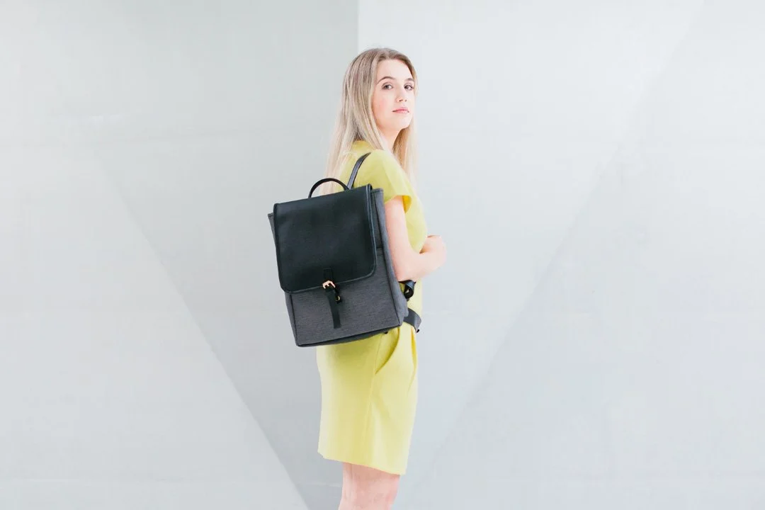
I needed some new product photos and model shots to set the vision for the brand and the website. I planned and storyboarded all the product shots, lifestyle shots, model shots for the company’s website, Facebook ads, and Instagram posts. I brainstormed 3-4 compositions for the photographer and models and laid out the objective for each shot in an easy-to-understand presentation.


Putting the website together
I designed 3 major website versions by testing different user flows and visual designs. In an attempt to optimize the conversion rate, multiple small iterations were also tested in between the 3 major versions. These iterations included a change in button or image placement, copywriting, swapping out elements to decrease website loading time etc.. Ultimately I was able to achieve a conversion rate of 20-30%, which is 1.5 to 2 times higher than the e-commerce benchmark.
First, I tested out the short form design as that’s very common among current e-Commerce sites. I quickly found out that it does not work well with a brand that only has 1 or 2 products. As visitors tend to fall off after they landed on the catalogue page.
In the next design, I decided to do a long-form, sales letter website. There are many examples of a website with this design that has proven conversion rate. I’ve also added a button in the hero section so when the visitor clicks “Shop Now”, the site will scroll down to the product purchase section immediately. This is convenient for customers that are looking for the price, but it doesn’t take them through all the value proposition. And without going through the value proposition, there is no momentum build-up for them to actually make the purchase when they reach the product section.
For my final design, I stayed with the long-form version but made some changes to the design and flow. Instead of giving the visitor an option to jump directly to the product section, I used prompts to nudge them to scroll down. By doing so, it would allow them to go through the value propositions before they reach the product section. I also added real customer reviews for social proof and changed the FAQ section into an accordion design so customers are not overwhelmed by all the text.
First Version - Short Form
Second Version - Long Form
Final Version
Facebook and Google Ads Design
To drive traffic to the site, I also designed and experimented with different ad configurations. I went through many iterations to maximize the amount of traffic to the website within the budget constraint. I was able to find the right formula and achieved a CPC of $0.30-$0.40 and a CPA of $0.76, which is 2-3 times better than the industry benchmark.


Conclusion
While the cart conversion rate itself is high at 30% (industry benchmark is 10.6%), I noticed that most customers abandoned their cart after seeing the price. This is surprising because, during the initial market research, many people had indicated that they would be willing to pay $300+ USD for such a product.
After testing out several different prices, $199 or lower seemed to be the price where buyers are willing to go through with the purchase. However, at such a price point, the profit margin will be too small.
I did a little research and found out that we can cut down the cost by 40 percent if we manufacture the products here in North America. Not only would it reduce the production cost to around $20 per bag but the shipping cost would be greatly reduced. However, the designer was hesitant to out-source the manufacturing process because they want to control the product quality by handcrafting all of their products in-house. All in all, I realized that the unit economics must work, or it would make it hard to grow a digital brand. And I decided not to continue with the partnership for this reason.
The biggest takeaway I had from this collaboration is that being a good designer is not just about slapping together a pretty visual, or even having a good sense of style. It is about designing to generate tangible and measurable results and creating real value for the business.
In this collaboration, I was able to take on the role of a growth designer and it gave me valuable insights into all the planning and preparation to launch a successful product. Being able to work with a real product, a real budget and having real-time feedback from potential customers allowed me to see exactly how even the smallest design changes can make a big impact on the end result, in this case, the conversion rate - and ultimately this is what drives revenue for the business owner.