
Introduction: Setting the Foundation
Workleap, a B2B HR and IT software company with over 400 employees, is known for its flagship product, ShareGate Migrate. For 18 years, ShareGate Migrate has been a trusted leader in data migration, contributing to 80% of Workleap’s revenue. However, the product’s growth had plateaued because data migration is a “one-and-done” deal. Once users completed their migrations, they rarely returned.
In response, our team introduced a new mailbox migration feature (the “Product”). The MVP was free to gather user sentiment and feedback, but transitioning it to a paid model posed significant challenges. Users accustomed to the free tool needed convincing to pay for continued access. This required introducing a new subscription tier without alienating our audience.
My Role in the Solution
As a Product Designer, I was tasked with optimizing conversion rates while maintaining a positive user experience. Drawing from my experience at a fast-paced cryptocurrency startup, I focused on creating a seamless and intuitive upsell process.
Design Challenge and Constraints
The perception of a “free” tool now requiring payment was a key hurdle. Offering the Product mostly free while placing select features behind a paywall risked leaving revenue on the table. Conversely, being overly aggressive could alienate our user base and erode trust. Communicating value while addressing potential frustration became the cornerstone of my design challenge.
Identifying the Existing and Potential Problems
To design an effective upsell flow, the first step was identifying current pain points and potential issues users might face with a paid mailbox migration feature.
Here’s how we did that:
User Journey Mapping: We analyzed every step of the user’s interaction with the upgrade process to pinpoint drop-off points and moments of friction.
User Interviews: Engaging directly with users, we sought to understand their expectations, frustrations, and perceptions of the feature’s value.
Customer Feedback Synthesis: Insights from customer complaints were invaluable in identifying recurring issues and improvement opportunities.
Here’s what we found:
Key Issues with the Existing Upgrade Flow
Friction in Trials: Accessing the full value of the feature required users to attend demos, webinars, or read lengthy documentation. Testing the feature without purchasing involved contacting sales or support for a trial license, creating unnecessary hurdles.
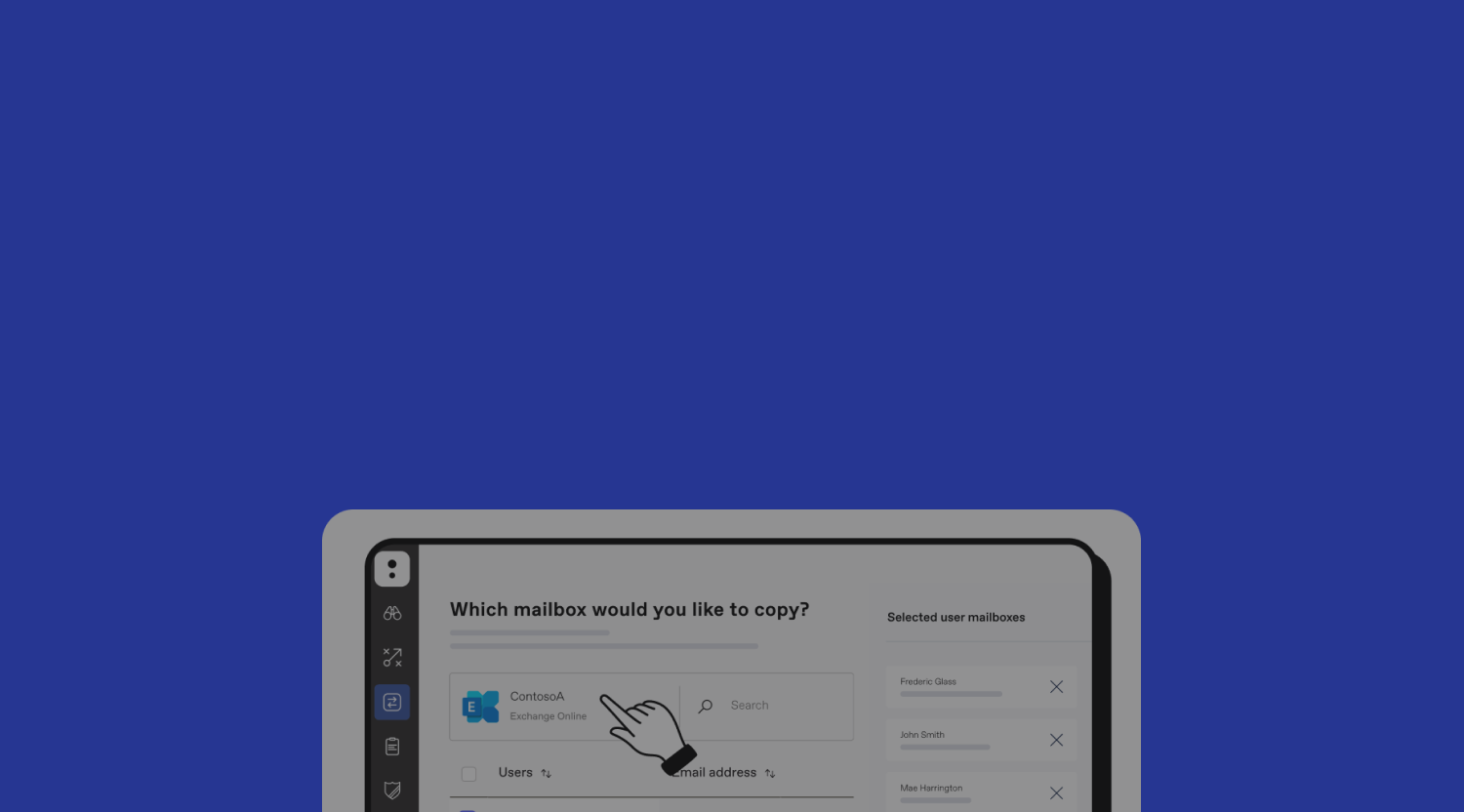
Disconnected Purchase Flow: Users encountering add-on features during their workflow couldn’t purchase them directly. Instead, they needed to navigate to “Settings > Manage License > Purchase or Request Quote”—all without being prompted. This clunky process disrupted user momentum.
Unmet Needs: Each organization’s Microsoft workspace setup is unique, and users wanted tailored insights into how the tool would work for their specific setup. This lack of personalization hindered trust and engagement.
Challenges We Anticipated
Job Interruptions: Users relying on the Product during an ongoing project risked abrupt cut-offs if the feature transitioned to paid access mid-task.
Pricing Concerns: Users who initially purchased licenses based on the promise of free access might face frustration if they now had to pay significantly more.
Crafting the Solution
Ideation Phase
The ideation phase began with a Crazy 8 brainstorming session involving the entire team—one PM, five developers, and one designer. This session surfaced diverse ideas, which we refined by:
Affinity Mapping: Grouping ideas into themes such as reducing friction, improving clarity, and enhancing engagement.
Industry Research: We examined successful models from companies like Dropbox, Adobe, and Figma, noting how they streamlined user experiences for enterprise customers.
Based on this research, we hypothesized that users would better grasp the feature’s value with interactive previews rather than relying on passive resources like documentation and webinars.
To validate this, we quickly built prototypes for A/B testing:

Prototype A: Upfront Paywall (current model): Users encountered a paywall before exploring the feature, supplemented by links to documentation and demo videos.

Prototype B: Post-Engagement Paywall: Users could configure and preview their setup before encountering the paywall, with supplementary resources integrated into the flow.
Testing Outcomes
The results were clear: 8 out of 10 users understood the feature’s value faster with prototype B. They found it faster and easier to understand the feature’s relevance when they could interact with it directly. By contrast, users expressed frustration with prototype A’s reliance on walls of text and video instructions.
The Final Solution
1. Interactive Previews: Enabled users to explore migration features with their own data, addressing the unmet need for relevance and personalized insights.
2. Post-Engagement Paywall: Allowed users to configure and preview without upfront commitment. Included demo videos and documentation as supplementary resources. Inspired by platforms like Squarespace, users could save their configurations during the preview and resume seamlessly after purchase.
3. Transparent Communication: Clear messaging during the preview informed users that payment was required to complete tasks. Existing tasks could be finished without charge, with payment required only for new tasks. Users received in-app and email notifications about the change days in advance.
By combining these solutions, we created a flow that balanced user satisfaction with business needs, resulting in successful monetization and bolstering trust in the product’s value.
Overcoming Challenges
Challenge 1: Developer Buy-In
One of the most significant challenges was securing developer buy-in for features like interactive previews and saved sessions. The team initially resisted, citing concerns about cost and complexity. To address this, I reframed our discussions around long-term value:
User-Centric Value: Demonstrating how saved sessions would reduce user frustration and support seamless task completion.
Business Impact: Highlighting how these features could drive higher conversions and long-term revenue growth.
Showcasing the test results, where 80% of users preferred the post-engagement paywall, was instrumental in turning resistance into support.
Challenge 2: Cross-Product Designer Feedback
Feedback from weekly design forums often conflicted due to varying levels of context among designers. To streamline this process, I:
Implemented Asynchronous Context Sharing: Using cards that outlined the problem, design rationale, and constraints, I ensured everyone had the same baseline information.
Requested Targeted Feedback: By asking specific questions, I reduced irrelevant or tangential discussions, allowing us to focus on actionable insights.
This approach not only aligned the team but also sped up decision-making.
Challenge 3: Designing for Desktop Tools
Unlike web-based tools, desktop applications require manual updates, making iteration cycles slower and testing more challenging. To mitigate these constraints, I:
Emphasized Research Rigor: Conducted extensive user interviews and usability tests to validate designs before implementation.
Made Deliberate Changes: Avoiding unnecessary risks, I prioritized solutions with the highest impact-to-effort ratio.
This methodical approach ensured that every change added measurable value without disrupting the user experience.
Results: Business Impact Beyond the Metrics
Quantifiable Success
The results of these design changes were not only encouraging but exceeded expectations:
Conversion Rate: The upsell flow achieved a 48.91% conversion rate, doubling the 10-20% industry benchmark.
Revenue Growth: In the first year, these changes contributed to an additional $1.55M in revenue.
Efficiency Gains: The streamlined process eliminated three unnecessary sales cycle touchpoints, allowing users to self-serve more effectively.
User-Centric Success
Beyond the numbers, we saw significant improvements in user satisfaction:
Reduced Frustration: By creating a more intuitive subscription process, we alleviated major pain points that previously deterred users.
Immediate Adoption: The first sale came through just two days after launch, demonstrating the immediate appeal of the new flow.
Team Recognition
The success of this project was a collective effort, and the recognition from my colleagues was deeply rewarding:
“Despite many challenges and obstacles, you stayed focused and never gave up. It was inspiring seeing you approach every task with passion and enthusiasm”
“You are always well prepared, you know your subject, and you provide great guidance during our meetings”
“Amazing job! I realized it even more in today’s demo. It’s as easy as 1, 2, 3”
Conclusion: Reflections and Future Directions
Takeaways
This project taught me that balancing user desires with business needs often feels contradictory, but transparency is key. Users value honesty and context-specific solutions. When we can help them get to the “aha” moment painlessly, conversions naturally follow.
Next Steps
Going forward, we plan to scale this approach to other ShareGate products, applying the principles and learnings from this project to enhance the trial-to-premium conversion journey across the board. By refining the subscription process and continuing to gather customer feedback, we aim to elevate the user experience and drive even greater business impact.
This case study encapsulates the heart of my design philosophy: combining empathy, data-driven insights, and strategic thinking to create user-focused solutions that deliver tangible results. To see more of my work, explore the Netcoins Dashboard or the Marais Project.